

Putting the 'person' back into a brand's personality for Firain
Branding | Illustration
Firain is a soft mutation of the old Welsh poetic word ‘mirain’ meaning ‘fair, lovely, splendid.’
Run by the wonderful Jo McCarthy, Firain is a treasure trove for creative shop keepers. Through mentoring and workshops, Jo helps crafters, makers, artists and curators sell their work online. After being an online shopkeeper herself, she knew the terrain and had fallen in love with the highs and lows of small business life, fascinated by the stories behind them.
Jo turned to us for help with her branding, after years of DIY-ing it. What leapt out to us during that first meeting was her friendly and thoughtful personality–we knew her branding had to be as unique as she was.
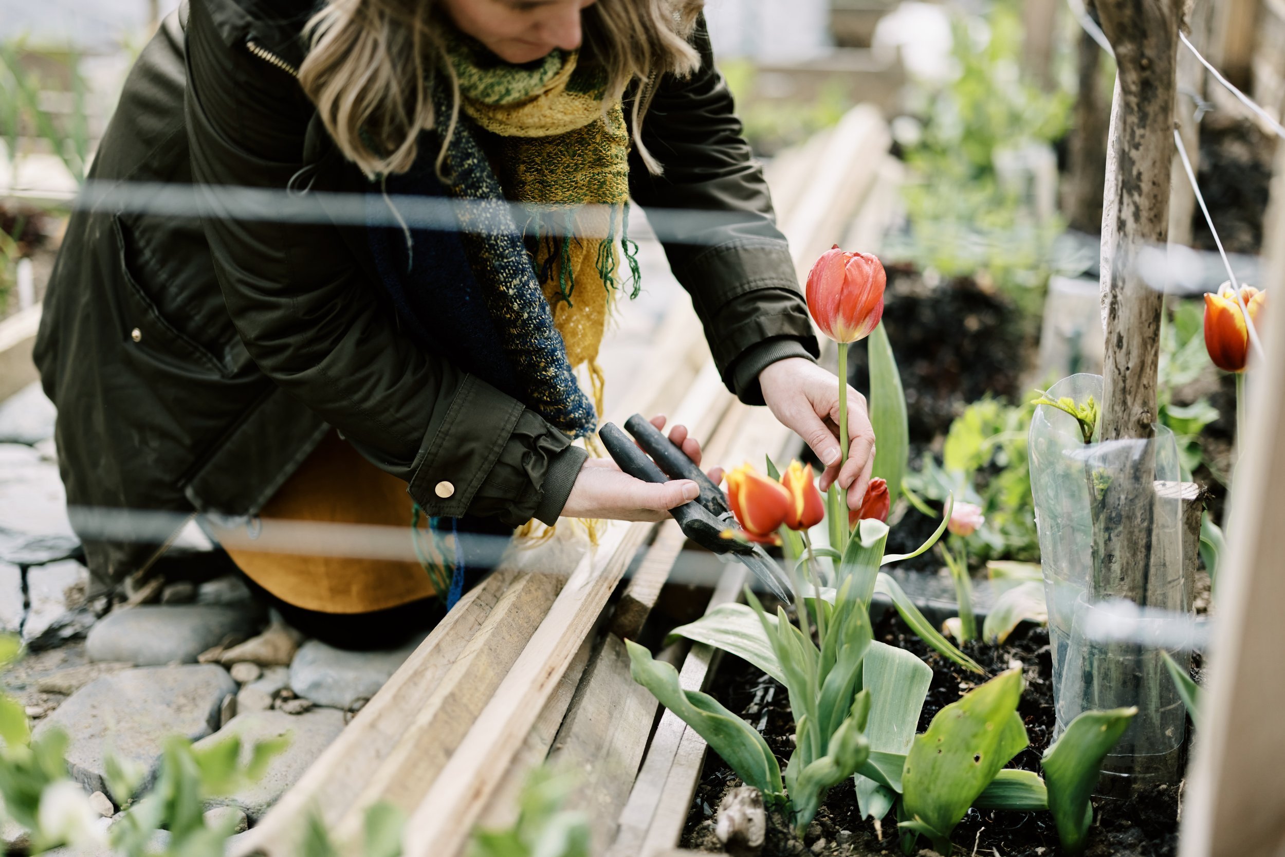
We aimed to capture her creative spirit by creating a brand that felt free and unrestricted. We turned to the landscapes which inspired and informed her. With roots growing in the beautiful North Wales coastal landscape, her brand needed to echo these grounded and natural elements. But we also sought to incorporate the richness and vibrancy of Jo’s travels–the character of Nigeria and the colour of Puerto Rico streets.
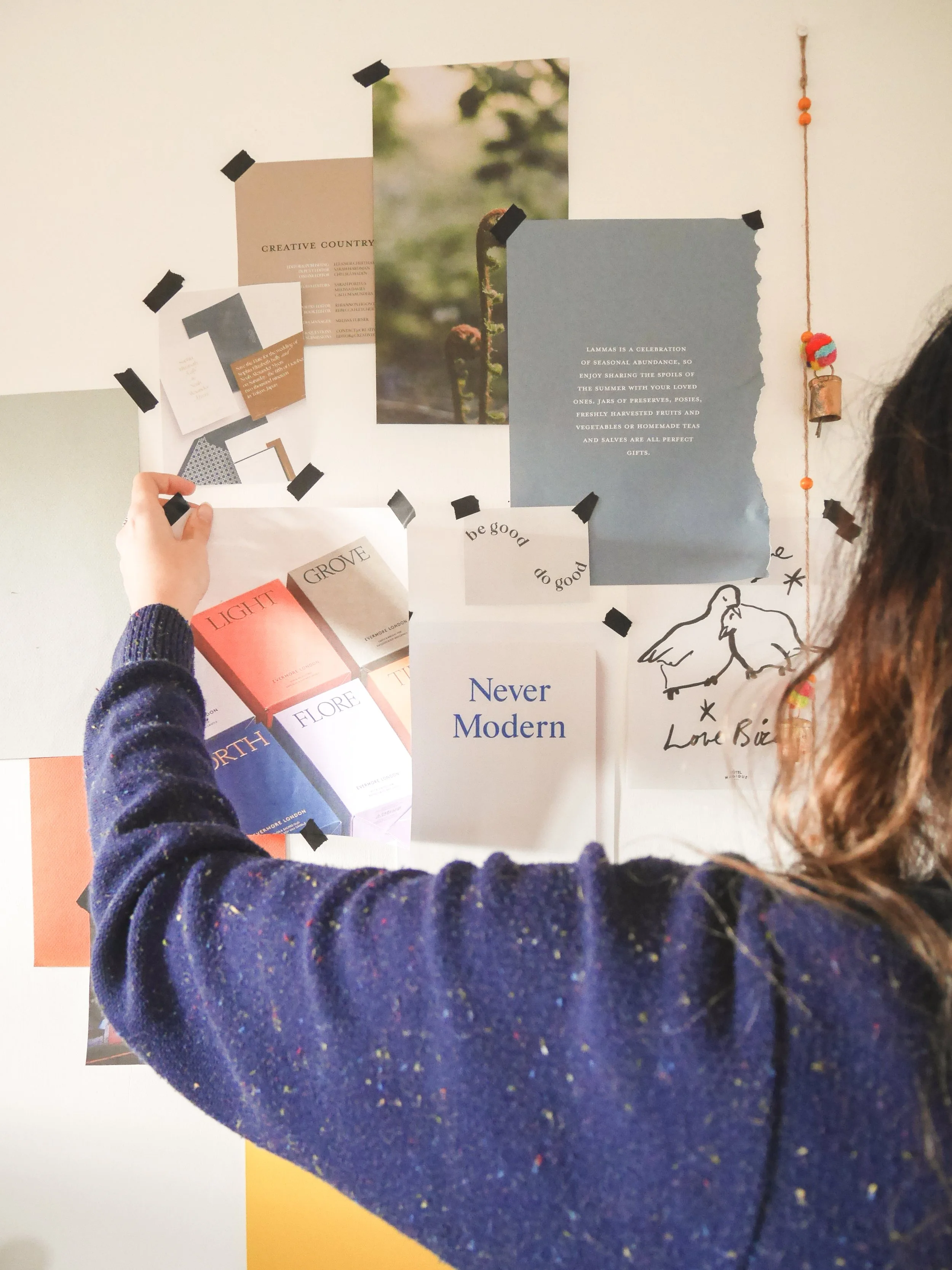
We created a bespoke and beautiful type face for her logo, plus supporting assets that counter balanced it. A varied palette represents all the different brand facets of Firain. Playful sketched characters and hand-painted shapes and textures bring fluidity into the brand and are easily translatable across digital. We equipped Jo with the tools to showcase her brand in a way that is completely her.


“ Kim and Sally were firmly on my radar; they had worked with my friend, Rebecca, at floral studio Ivy, Pip & Rose, and I loved watching from the sidelines as a bespoke brand identity bloomed into life.
When it was my turn to collaborate, the thoughtful and sensitive Somewhere Off Grid approach felt right for me, as well.
Kim and Sally take a fresh approach to each project. No cookie-cutters are hiding in their studio. After just a few rounds of edits, I saw the illustrations and brand assets that form the new Firain identity. Reader, I cried. I couldn't quite believe how Kim and Sally had crafted something that captured the essence of my business from my sprawling ideas, jumbled Pinterest boards, and ramblings. They have a valuable ability to be both artists and understand the small business landscape.”
Jo McCarthy - Firain

Similar Projects
Xeno
Branding | Website Design
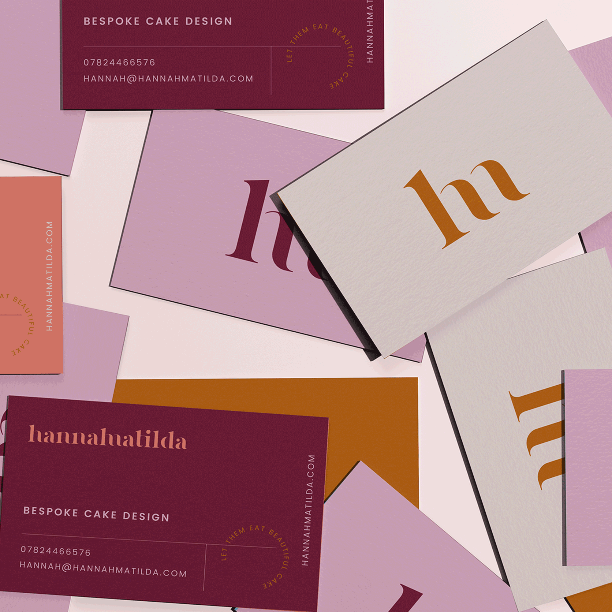
Hannah Matilda
Branding | Colour Exploration