

A brand good enough to eat, for Hannah Matilda
Branding
Hannah had been creating and baking the most incredible cakes for special occasions for several years, and had started to really make a name for herself, yet, with a lack of a brand or identity for her business - she never really felt like a ‘proper’ business.
After being connected through another agency we worked with, we set about trying to give Hannah a brand that was worthy of the wonderful cakes she created.
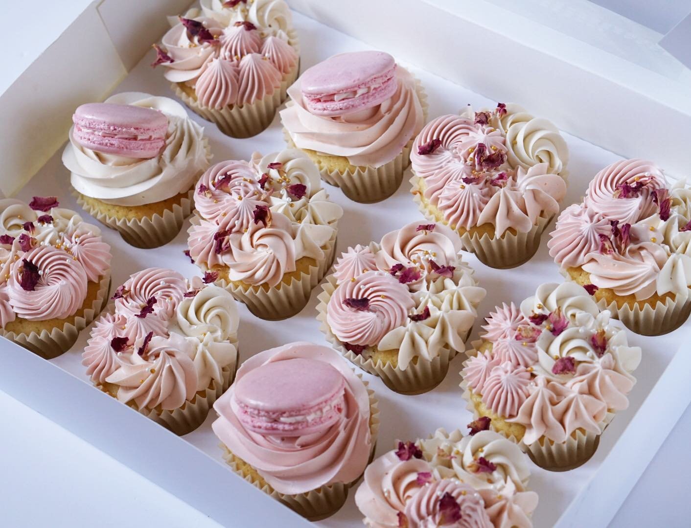
The occasion cake industry was quite a saturated one, and every other brand seemed to march to the same drum when it came to their identity - hand script fonts, pretty illustrations and lots of pinks and whites. Hannah’s needed to be different. She wanted it to feel modern and memorable, yet still delicious, edible and luxurious.
From the concept moodboards we created, Hannah quickly started to get a really strong direction for the look and feel she was after. The bold clashing colours of Hannah’s creative frosting were the starting point for the visual direction. Such a strong palette needed a bold, yet feminine font that would stand up to the surrounding elements. As Hannah is her brand, her full name needed to be the logo, but we also wanted to develop a mark that would be just as strong to use as a stamp, or profile. Playing with Serif style fonts, and their flicks and kicks, that reminded us of the flicks at the end of piped icing, the connected H & M started to emerge. This bold beautiful logotype mark held its own against the strong palette, and the brand had the delicious, pretty punch that we were after.


Got a project in mind?
We love working with like-minded folks.
Similar Projects

Firain
Branding | Illustration

Ivy Pip & Rose
Branding | Illustration