

A brand made from collection of precious things
Branding | Packaging Design
Katherine Lees is a maker and ceramicist from Manchester. She creates unique pieces inspired by keep sakes and memories. Her range of products represent collections of precious treasures, she wanted a brand that spoke of this and told the story of her handmade products becoming small parts of someone else’s story.
We explored a wide range of hand-drawn, sketched, painted, and printed marks that were inspired by Katherine's work. We wanted the brand to feel as unique as the pieces that she made, with a sense of curation, and the feeling of joy sparked by finding beautiful objects.
The simple cursive shapes of the pots, vase, and keys are motives found within Katherine's work and have been since she first started creating. We paired this with an elegant san serif font that lifted the brand, making it feel timeless, professional, and friendly. The colours speak to the work Katherine creates, with a nod to the natural world, and the natural colours of clay and porcelain.
Adorning the packing, the walls of her studio as well as her digital platforms, we love how strongly this brand represents everything Katherine is, with a light but unique touch.


Similar Projects
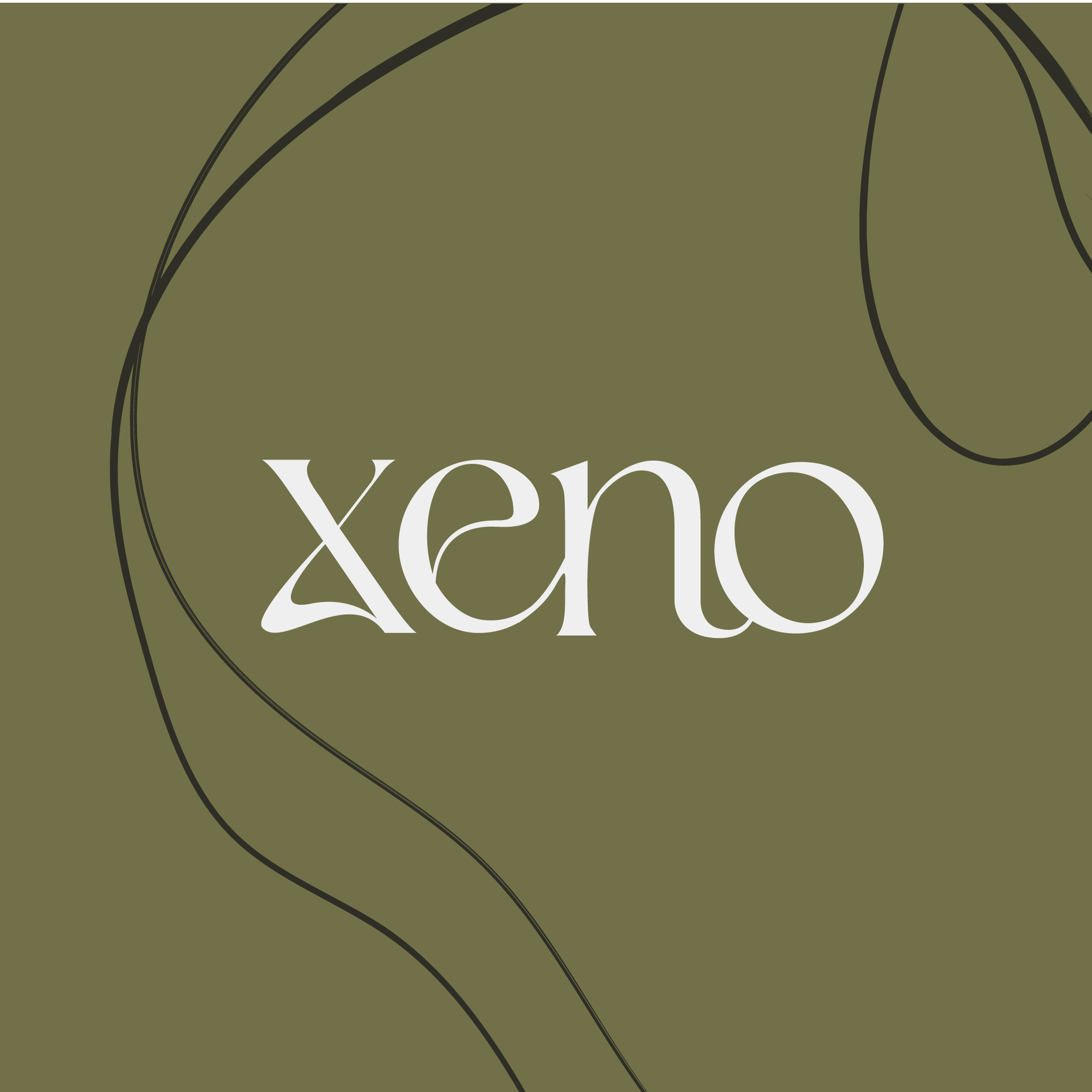
Xeno
Branding | Website Design
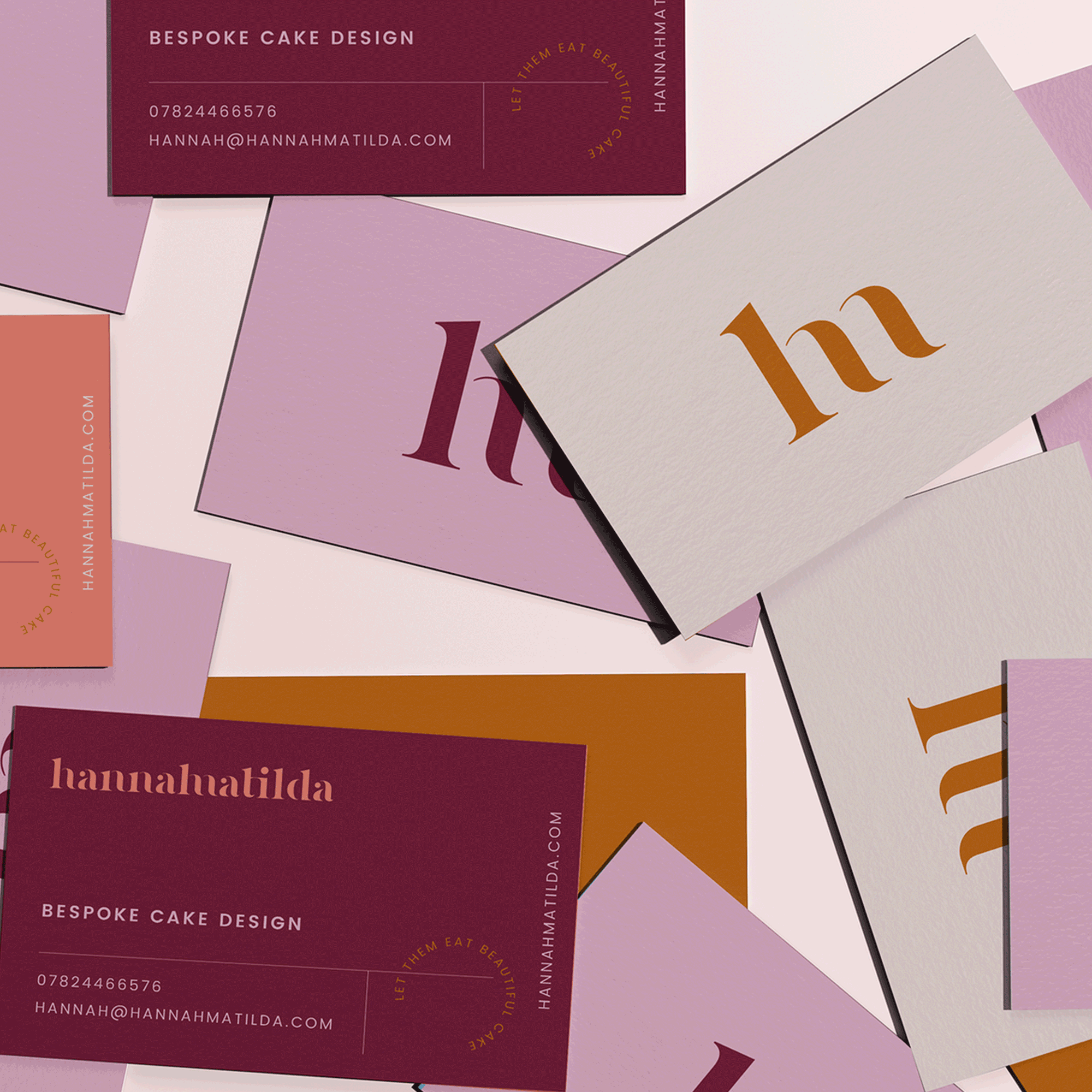
Hannah Matilda
Branding | Colour Exploration